WebView
웹 브라우저와 연결시켜 줄 때 필요한 것 같은데... 더 공부해 볼 예정. 솔직히 그냥 링크로 들어가면 되는 일인데 왜 필요한지 잘 모르겠다.
Surface
: 프로젝트 생성 시 가장 먼저 눈에 보이는 것
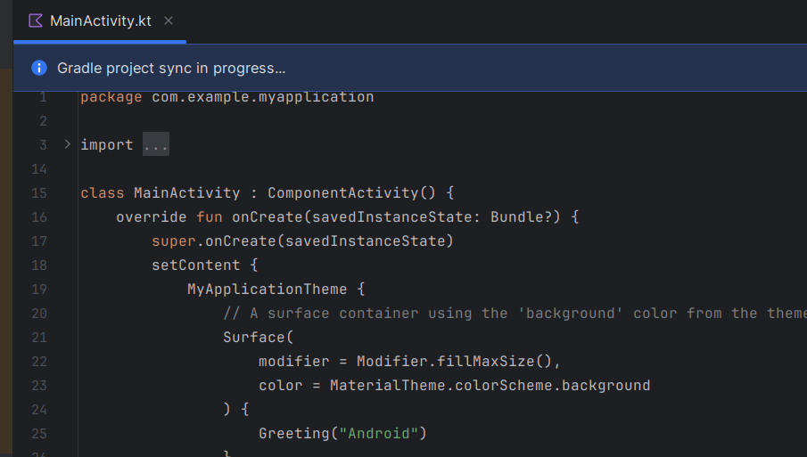
이렇게 21줄부터 생성돼 보이는 것!!
Scaffold
: 이거 중요하다... 상단 바, 하단 메뉴, 하단 우측 메뉴 바를 쉽게 만들 수 있도록 도와 주는 것
@OptIn(ExperimentalMaterial3Api::class)
@Composable
fun MyTopBar() {
    TopAppBar(
        title = {
            Text(
                text = "Main"
            )
        },
        navigationIcon = {
            IconButton(onClick = {}) {
                Icon(Icons.Default.Add, contentDescription = "add")
            }
        },
        actions = {
            Button(onClick = {}) {
                Text(text = "Btn")
            }
        },
        colors = TopAppBarDefaults.smallTopAppBarColors(Color.Red)
    )
}

@Composable
fun MyFlotingActionButton() {
    FloatingActionButton(onClick = { /*TODO*/ }) {
        Icon(Icons.Default.Menu, contentDescription = "Menu")
    }
}

@Composable
fun MyBottomBar() {
    BottomAppBar(
        containerColor = Color.Red
    ) {
        Row(
            modifier = Modifier.fillMaxWidth(),
            horizontalArrangement = Arrangement.SpaceBetween
        ) {
            IconButton(onClick = { /*TODO*/ }) {
                Icon(Icons.Default.Home, contentDescription = "Home")
            }
        }

    }
}
이런 식으로 세 요소의 함수를 모두 만든 뒤
@Composable
fun MyScaffoldEx() {
    Scaffold(
        topBar = {
            MyTopBar()
        },
        floatingActionButton = {
            MyFlotingActionButton()
        },
        bottomBar = {
            MyBottomBar()
        }
    ) { paddingValues ->
        Surface(
            modifier = Modifier
                .fillMaxSize()
                .padding(paddingValues)) { // topbar 때문에 텍스트가 안 보일 수도 있기 때문에
            Text( text = "this is content ")
                }
    }
}
이렇게 띄워 주면 완성!
번외이지만... padding이나 margin 주는 게 진짜 중요...
뷰가 차지하는 영역 크기를 크게 잡으면
그 뷰가 차지하는 공간과 겹치는 다른 뷰는 안 보임 ㅠ
LazyColumn, LazyRow
: 길이를 알 수 없는 목록 표시 경우 필요한 만큼만 천천히 로드해 주는 역할! xml에서는 recycler view가 이 역할을 하는 듯
+) recyclerview보다 lazycolumn이 더 구현하기가 쉽다....................
@Composable
fun MyLazyColumn() {
    val textList = listOf(
        "A", "B", "C", "D", "E", "F", "G", "H", "I", "J", "K", "L", "M", "N", "O", "P", "Q", "R", "S", "T", "U", "V", "W", "X", "Y", "Z",
        "A", "B", "C", "D", "E", "F", "G", "H", "I", "J", "K", "L", "M", "N", "O", "P", "Q", "R", "S", "T", "U", "V", "W", "X", "Y", "Z",
        "A", "B", "C", "D", "E", "F", "G", "H", "I", "J", "K", "L", "M", "N", "O", "P", "Q", "R", "S", "T", "U", "V", "W", "X", "Y", "Z",
        "A", "B", "C", "D", "E", "F", "G", "H", "I", "J", "K", "L", "M", "N", "O", "P", "Q", "R", "S", "T", "U", "V", "W", "X", "Y", "Z"
    )

    LazyColumn {
        items(textList) { item ->
            Text(
                text = item,
                fontSize = 60.sp,
                modifier = Modifier.fillMaxWidth()
            )
        }
    }
}
규모가 작은 일반 텍스트 뷰들로 연습해 봤는데 recycler view까지 공부하고 온 나한테는
너무 이게 맞는 듯
ProgressIndicator
: 게이지가 차는 바 같은 거 (xml에서 progress bar)
이번에 개발 중인 앱 페이지 중 내가 맡은 부분에 막대 형식으로 나온다...
@Composable
fun MyProIn() {
    var progress by remember { mutableStateOf(0.0f) }

    Column (
        modifier = Modifier.fillMaxSize(),
        verticalArrangement = Arrangement.Center,
        horizontalAlignment = Alignment.CenterHorizontally
    ) {

        Button(onClick = {
						if (progress < 1.0f) {
							progress += 0.1f // 막대 바가 옆으로 넘어가는 거 대비
						}
        }) {
            Text (
                text = "분노 게이지",
                fontSize = 30.sp
            )
        }

        LinearProgressIndicator(
            progress = progress,
            modifier = Modifier.height(10.dp),
            color = Color.Red,
            trackColor = Color.Cyan
        ) // 직선 게이지 차게 하기

				CircularProgressIndicator(
            progress = progress,
            color = Color.Yellow
        ) // 동그란 링 게이지 차게 하기

    }
}
위 코드는 컴포즈로 공부해 본 간단한 예시인데 역시 구현이 간단하고
게이지 종류를 선택하기가 훨씬 쉬움!!
'프론트' 카테고리의 다른 글
| [코스모스 9주차] Compose UI 기초심화와 연습 앱 개발 (with xml) (0) | 2024.05.16 |
|---|---|
| [코스모스 7주차] Compose UI 깊게! (1) | 2024.05.02 |
| [코스모스 6주차] Retrofit & Compose UI (2) | 2024.04.11 |
| [코스모스 5주차] Android Studio Kotlin 기본 문법 4 (0) | 2024.04.04 |
| [코스모스 3주차] Android Studio Kotlin 기초 문법 3 (0) | 2024.03.21 |


